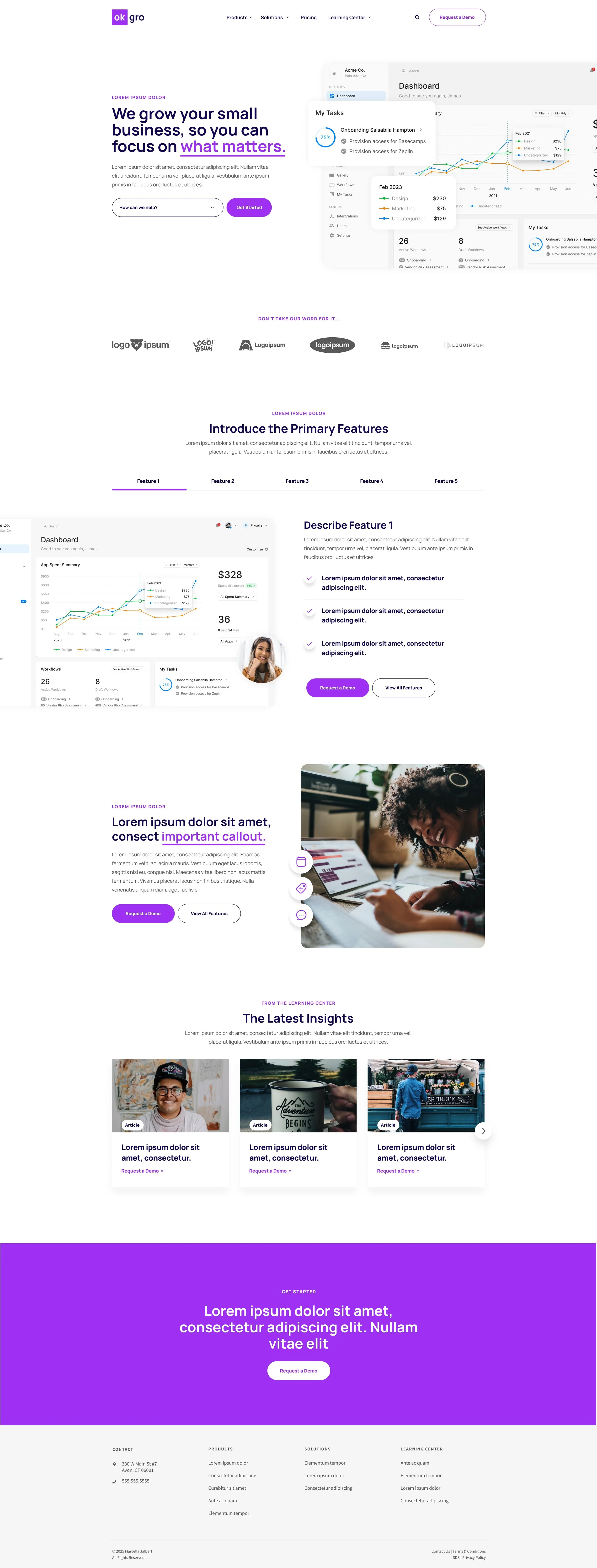
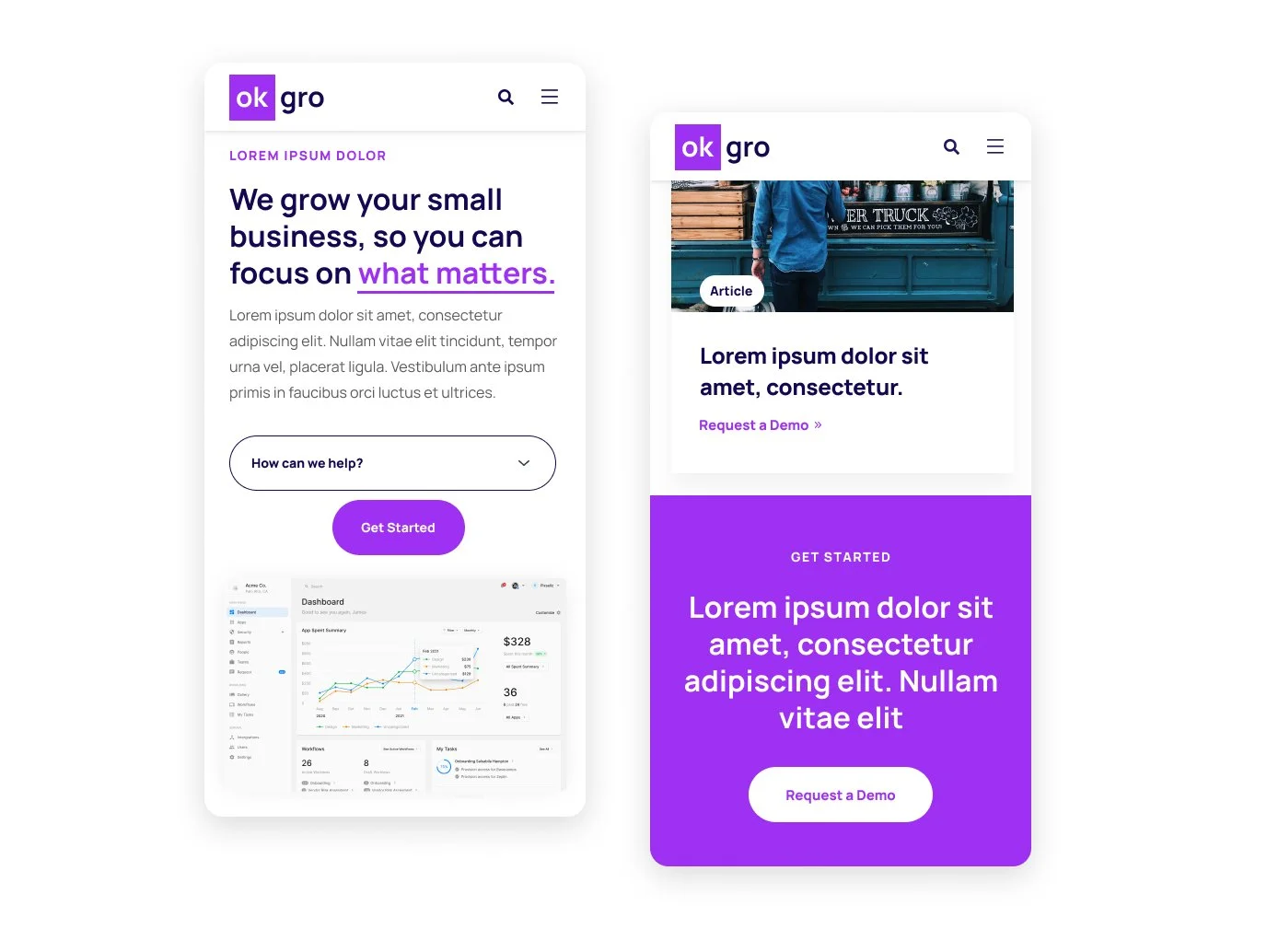
Concept for a CRM for freelance creatives
ok gro needed a new website that:
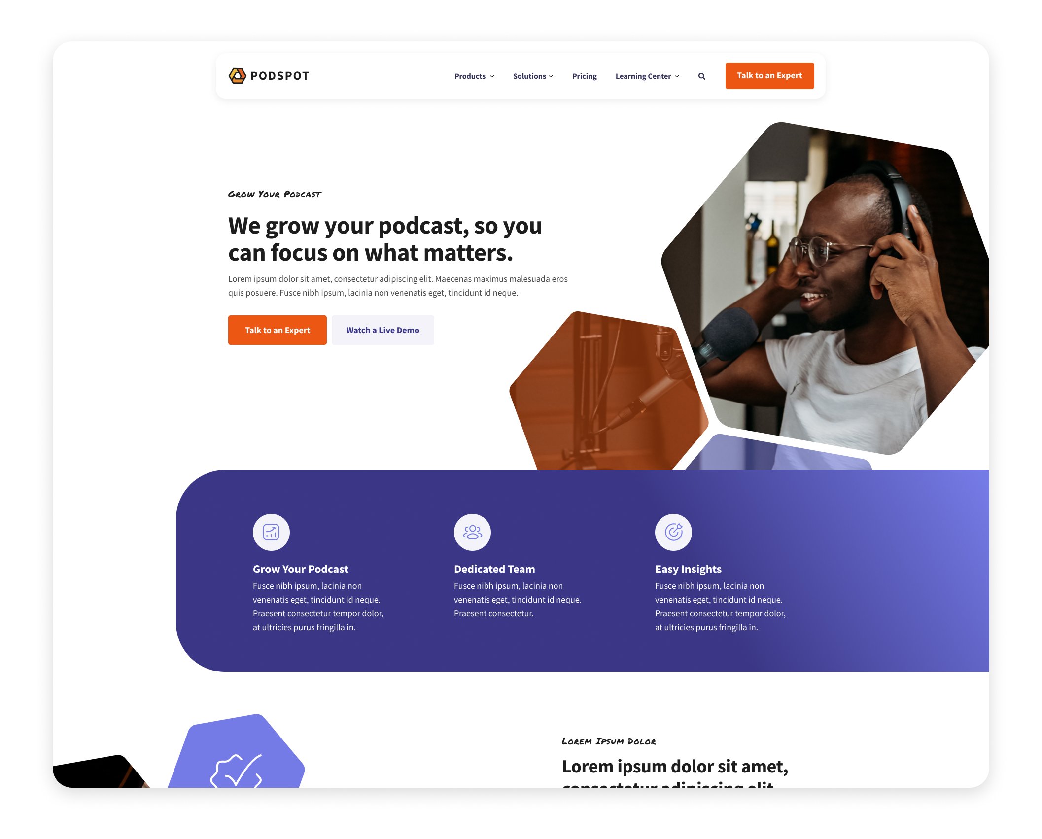
showcased their software
highlighted software features
was clean, bright, and friendly
achieved WCAG AA accessability
highlighted the beautiful diversity of their users
Key elements:
use of brand “honeycomb” shape for brand recognition
handwritten font for a friendly, human appeal
alternating bold and and clean sections for a progressive feel
Other Projects
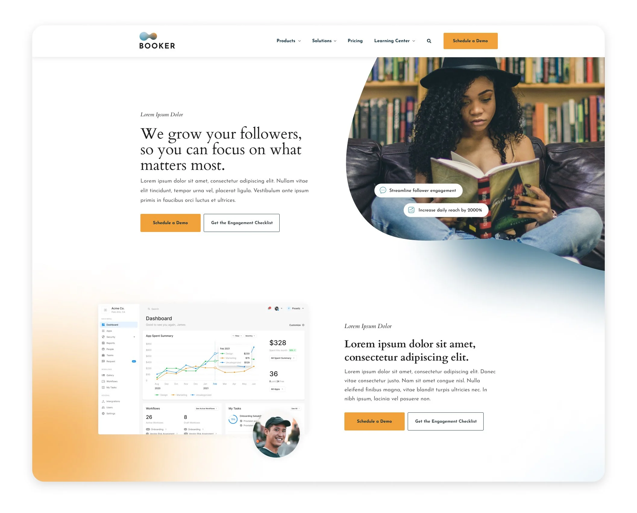
Booker
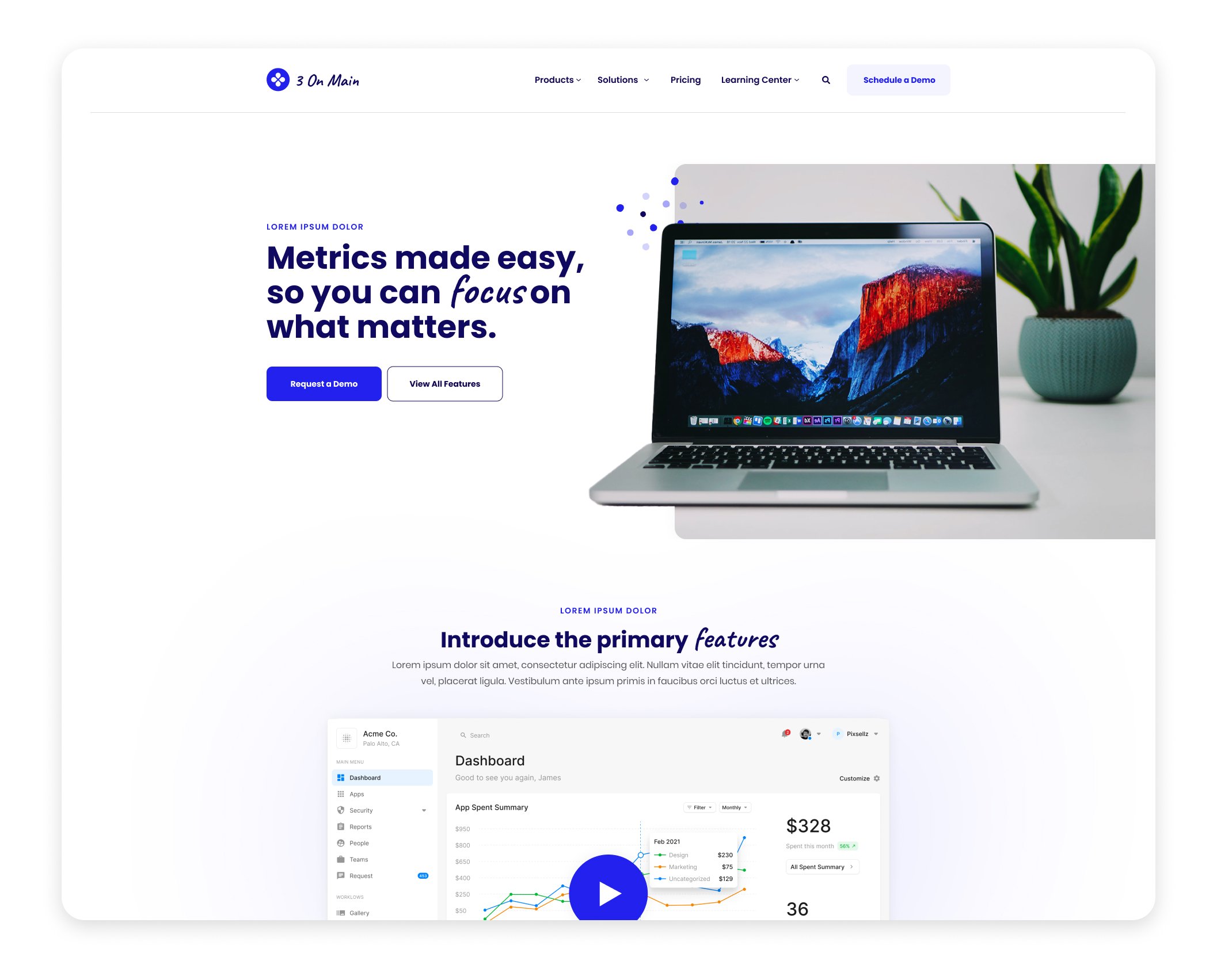
3 on Main
Podspot
Thinking about improving your user experience? I can help!
Marcella